
Sharp App
How might we help patients feel more in control of their healthcare by making digital access easier, faster, and more intuitive?
This project was all about meeting patients where they are—on their phones, often juggling multiple responsibilities, and looking for quick, clear answers about their health.
We focused on supporting:
-
Adults managing ongoing care
-
Caregivers handling appointments and prescriptions for family members
-
Patients with chronic conditions who rely on frequent communication with their care teams
The app needed to make all of that feel simple, accessible, and supportive.
Goals
Our goal was simple: make it easier—and more enjoyable—for patients to manage their health. We wanted the app experience to feel thoughtful, intuitive, and even delightful, especially in a space that often feels overwhelming or transactional.
While Epic’s MyChart platform offers a ton of valuable features, such as:
-
Secure messaging
-
Appointment scheduling
-
Test results access
-
Bill payment
Many organizations use it out of the box. That often leads to clunky navigation and disconnected experiences. We saw an opportunity to reimagine how patients first engage with these tools, starting from the moment they open the app.
About Epic
Epic is the gold standard for patient health records, and being on Epic ensures data is consistent and accessible across providers. But its default app experience often doesn’t reflect how patients actually think or behave. By customizing the entry points and home screen, we were able to bring clarity, ease, and intentionality to the patient experience—without sacrificing the power of Epic behind the scenes.
Informed Design
To keep the experience grounded in real needs, we held regularly scheduled user testing sessions throughout the project. We also partnered with our Consumer Insight Group—a diverse panel of patients we consult with monthly—to gather feedback on early concepts, new features, and language. Their input helped shape everything from navigation to tone of voice, and ensured the app was truly designed with patients, not just for them.

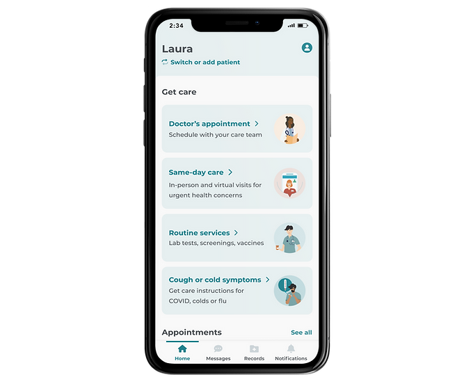
Implementation
We designed and launched a hybrid mobile app that combines Epic’s MyChart functionality with a set of custom entry point screens. These screens prioritize what patients use most and help them get there without friction. Everything lives within a secure, unified experience, but with a look and feel that aligns with Sharp's brand and values.
It was important to make sure the app felt like part of a larger, connected experience—not an isolated product. While the app uses a custom set of components, I intentionally aligned it with our existing design language, patterns, and visual style from the website. You can feel that connection in the typography, tone, layout, and subtle UI details. It’s not a 1:1 match, but it feels like a sibling to our website—familiar, branded, and intentional.
.png)
Launch to Impact
Since launch, our Epic-powered app has become an essential tool for patients — and a significant driver of value for the organization. As of August 2025:
Adoption & engagement
• 500K+ activations in the first year
• 50,000+ daily active users (DAU)
• 170,000+ monthly active users (MAU)
• ~25% stickiness (DAU/MAU) — a level industry benchmarks classify as “excellent” repeat engagement
Financial impact
-
$13.4M in savings this year, with $16.8M projected next year
-
~$12M tied directly to the app, driven by:
eCheck-In & Online Scheduling (~$5.4M)
Streamlining appointment workflows and reducing staff time
Fast Pass & Video Visits (~$2.1M)
Offering flexible care options that improve efficiency and reduce no-shows
Clinical Efficiencies (~$3.7M)
Enabling patients to submit questionnaires and updates ahead of visits, reducing in-clinic time
Paperless Billing & Digital Payments (~$500K)
Modernizing billing and cutting printing and postage costs
Self-Service Tools (~$175K)
Allowing patients to manage records and proxies without staff intervention
The app’s ease of access and integration with Epic have turned these digital tools into daily habits, driving engagement, patient satisfaction, and millions in measurable savings across the system.
The app is available for download in both the Apple App Store and Google Play.
Gratitude
This project was a collaborative effort across UX, content strategy, product management, web development, and clinical operations. It wouldn’t have been possible without the dedication and insight of a cross-functional team all working toward a shared goal: making healthcare more accessible, intuitive, and patient-centered.